LT 1.1 Why graphic design history is important
Before starting with the next lessons in the days to come and deep diving into some of the highlights of the modern history of graphic design, it will be beneficial to get a broad overview of the field. Discover the power of imagery with Sean Adams in the LinkedIn Learning Course below. After completion (with some quizzes in between), you’ll receive a LinkedIn Learning Certificate.
Sean Adams managed the AIGA historical archives – the world’s largest collection of graphic design history. In this course, he focuses on the hows and whys of each design movement, detailing the development and evolution of specific styles, techniques, and genres.
Additional task
Before starting the course, get a pencil and a piece of paper ready to draw a horizontal timeline. Make rough notes on the timeline as the course goes on. It does not have to be neat or technically correct in every way! It’s just a way for you to understand how the periods overlapped and influenced each other.
LT 1.2 Suprematism and Constructivism
Describe the similarities and differences between suprematism and constructivism. There is no prescribed word count; you just need to show that you understand the movements in broad terms.
- For each of these movements, find examples from their eras, and then two contemporary designs you think are influenced by these styles.
- Explain, in your own words, how you can see the influence of suprematism and constructivism in these modern-day designs.
Similarities: Both movements emerged in the context of the Russian Revolution, rejecting traditional representational art in favor of avant-garde experimentation. They embraced abstraction as a means of artistic expression, challenging established norms and influencing the trajectory of modern art. Both movements had a lasting impact on the development of modern art, contributing to the broader avant-garde movement.
Differences: Suprematism focuses on the pure, non-representational expression of feeling through geometric forms on canvas, while Constructivism extends beyond traditional art forms to encompass a broader range of practical applications, emphasizing functionality, industrial materials, and the integration of art into everyday life.
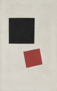
Suprematism artist and artwork: Kazimir Malevich. ”Painterly Realism of a Boy with a Knapsack – Color Masses in the Fourth Dimension” 1915
Modern Suprematism artist and artwork: Ellsworth Kelly. ”Yellow over Dark Blue” 1964–5
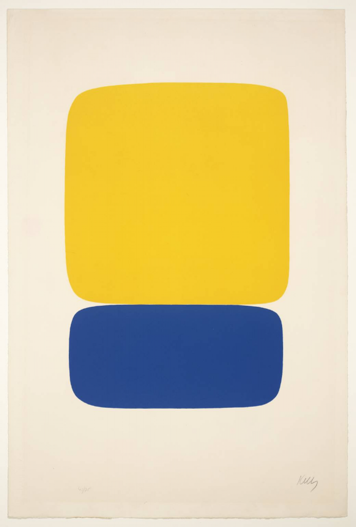
How I see infuence of Suprematism in the modern design:
In this example, Ellsworth Kelly has obviously taken inspiration and influence from the Suprematism era, with his bold, abstract, simple shapes with a lot of white space. Ellsworth’s paintings are often colorful, but with toned down colors to not make it too flashy. The abstract shapes represents feelings and expressions with not really any true meaning for the masses. This is one of the characteristics of suprematism.
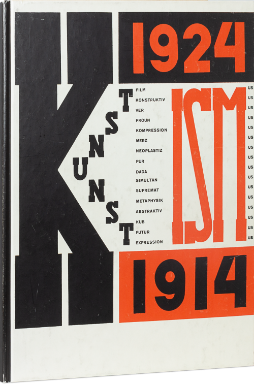
Constructivism artist and artwork: El Lissitzky. ”Hans Arp and El Lissitzky, Die Kunstismen” 1914–1924
Modern Constructivism artist and artwork: Liam Gillick. ”Gwangju Stool, The Work Life Effect, Korea” 2021
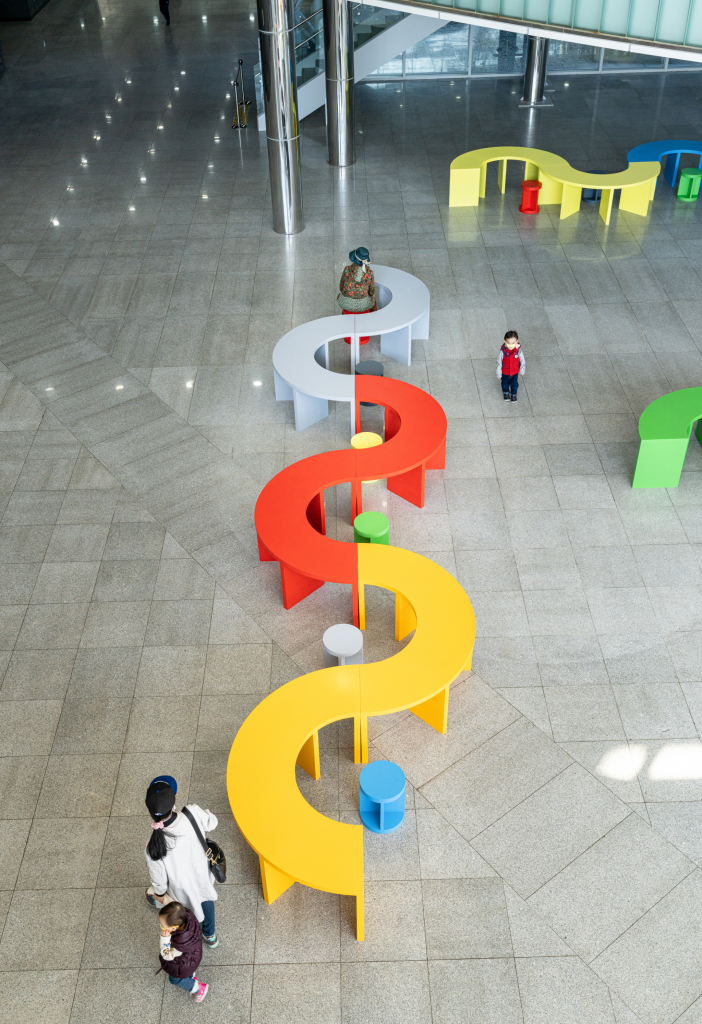
How I see infuence of Constructivism in the modern design:
Here, I can see the influence from the Constructivism era by the means that the artwork is colorful, but retained within a small palette. The shapes are bold and abstract, but has a meaning. The art is also in the public, giving the masses availability to utilize it and integrating the art into everyday life.
Sources:
https://www.moma.org/collection/works/80383
LT 1.3 De Stjil and Bauhaus
Today we’re taking a break from theory and having some fun with pixel art. Traditionally, pixel art was not seen as art at all; it was merely seen as a way for, particularly video game developers, to use a limited number of pixels to create images.
But it’s really a lot like abstract art: it represents a pictorial element in its simplest, purest form using only squares and flat colours. It forces the creator to focus and isolate only what is most important in an image without providing the finer control you could apply in a more detailed drawing style. Think of it as modern-day Piet Mondrian.
Build a pixel art version of one of the options below as a vector image in Illustrator. The idea is to make something that’s as simple as possible, using a limited number of squares (‘pixels’) and flat colours.
My attempt at Pixel art: I chose to make my tiny dog Paco’s face as good as I could.
LT 1.4 The International Typograpic Style
Part 1
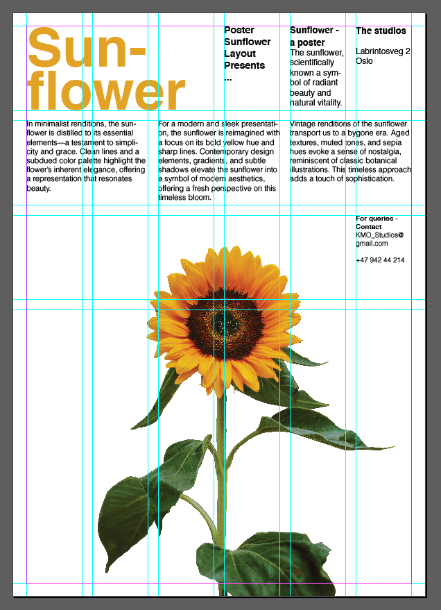
Today you’ll design a simple but striking poster using the Swiss-style grid – based on the work of Josef Müller-Brockmann. You can either use InDesign or Illustrator, and the task shouldn’t take longer than an hour – in fact, it should take far less than an hour. You may spend most of your time searching for a perfect photo.
Use John McWade’s tutorial below as a guideline. Swiss style grids, part 2
You can use the poster designed during this tutorial in your course assignment leaflet to showcase The International Typographic Style (see your course assignment for more information).
By following the tutorial, I learned how to make the grid, and how to use it. With that knowledge, I made a similar layout but with a sunflower as my object. I decided to go for sunflower, because I felt this is an object I can use across the rest of the styles.
Part 2
Design an A2 poster for a Stavanger Symphony Orchestra concert. The concert consists of two parts. The first is a commission from local composer Ståle Kleiberg who’s known as a composer for grand occasions. The Turangalîla-Symphonie by Messiaen follows the intermission, which according to the composer, is a love song.
Use the Swiss style grid to organise the information and the typeface Helvetica. Place the main focus on the image and heading.
The heading of the poster should be SEASON OPENING.
The rest of the information that needs to feature is the following:
PROGRAMME
Ståle Kleiberg (born 1958):
Commissioned work for Stavanger anniversary – World Premiere
Olivier Messiaen (1908-1992):
The Turangalîla-Symphonie
CONTRIBUTORS
Andris Poga, conductor
Pierre-Laurent Aimard, piano
Nathalie Forget, ondes martenot
VENUE
Fartein Valen, Stavanger konserthus
Image – Choose a main image to complement the information. You may use a photograph or typography as an image.
Feel free to make more than one poster by simply replacing the image and changing the mood of the design completely.
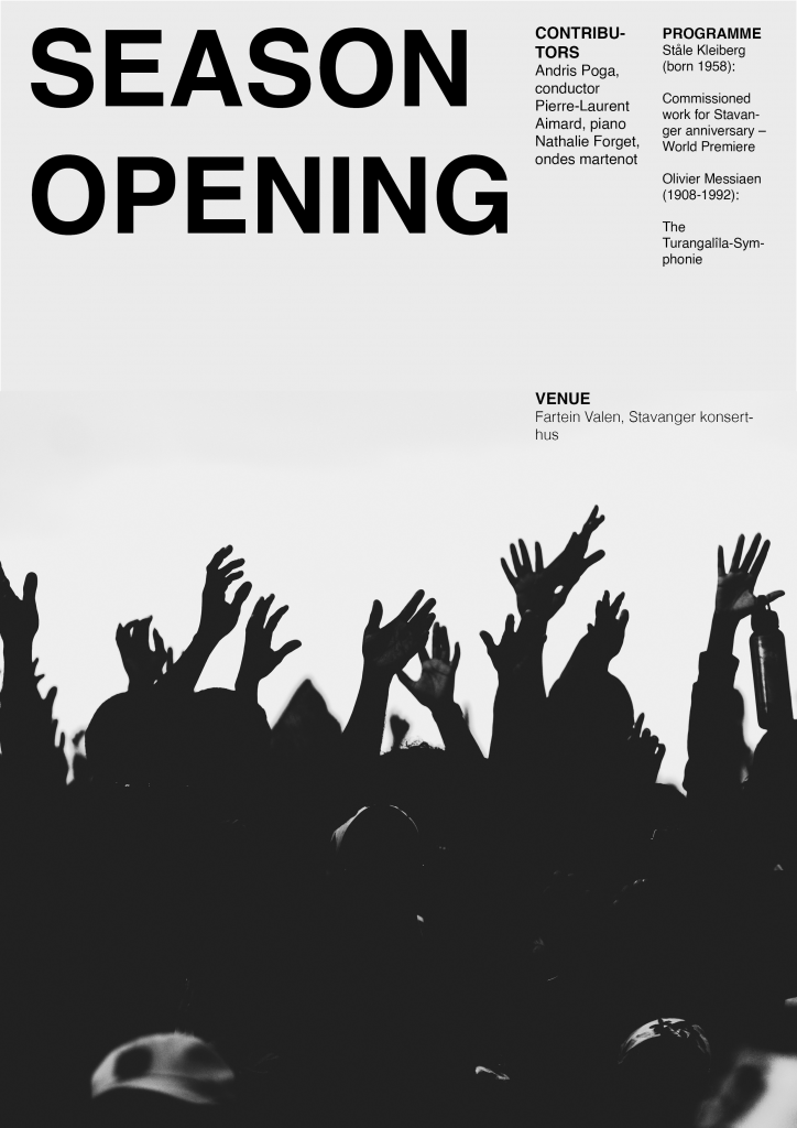
Image source: https://unsplash.com/photos/silhouette-of-people-raising-their-hands-LOV7Gbmgm30