LT 1.1
Develop a name for a dog food product. Design a logo for this product, using full colour. The logo must contain a main visual and typography. (Use the “People Saving Pets” logo as a guide – this does not mean your design should be the same, it is simply an example.) Follow each of the fundamental steps outlined above, in that sequence and take note of what needs to be handed in as you progress through these steps:
- Exploration – Use sketching techniques to draw thumbnails and hand in your thumbnails as scanned PDFs.
- Focus – Highlight three of the thumbnail ideas that you consider the best options and state why. Hand in an A4 with visuals of the three chosen thumbnails; include reasons for choosing each of these three options.
- Construction – Use sketching techniques and redraw ONE of your chosen concepts until you’ve reached a conclusion on a successful logo. Hand in your drawings as scanned PDFs.
- Testing – Experiment more with your favourite options from Step 3 and ask the opinion of a few people. Hand in examples of the logos shown to people and write their feedback or opinion on each.
- Refinement – Choose your final design and execute it in Adobe Illustrator, along with the name of the product. Hand in your final logo as an A4 PDF.
Name ideas:
Pelly Pellets
BarkBites
Wagworthy
After some thinking about a some names, these are the names i came up with for the product: Wagworthy, BarkBites and Pelly Pellets. I decided to go for BarkBites after thinking about logo ideas. I wanted to go for a Jester archtype and play on a more fun and illustrative design which dog food products usually go for. This is because this style works well due to the friendly and often goofy look.
Exploration – I sketched out 9 different logo thumbnails, and started thinking about which ones I liked the best.
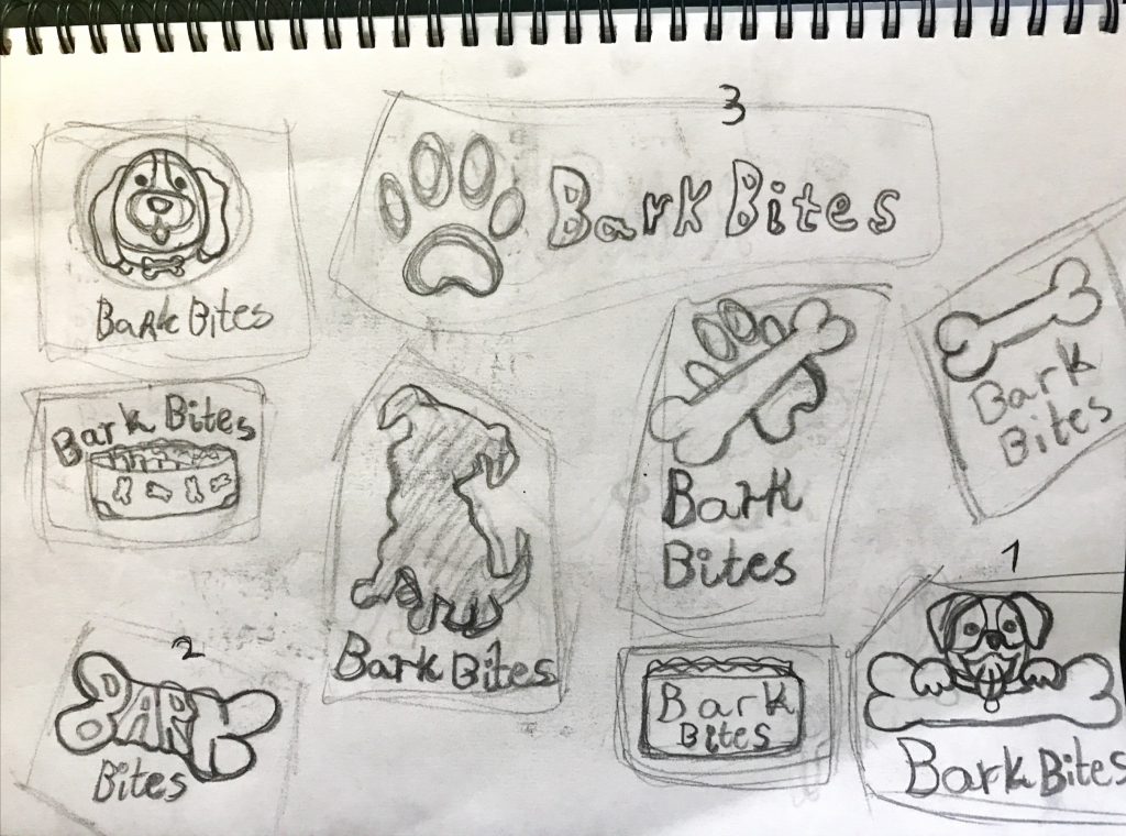
Focus – I highlighted three of the thumbnails I considered the best, which is number 1, 2 and 3.
The reason I chose number 1 is beacuse it is playful and has potential to be recognizable.
The reason I chose number 2 is because it’s more creative and has an interesting take on the logo that could be fun to explore.
The reason I chose number 3 is because it is a very generic logo, which if any other fail would be a safe logo choice, being straight forward in design.
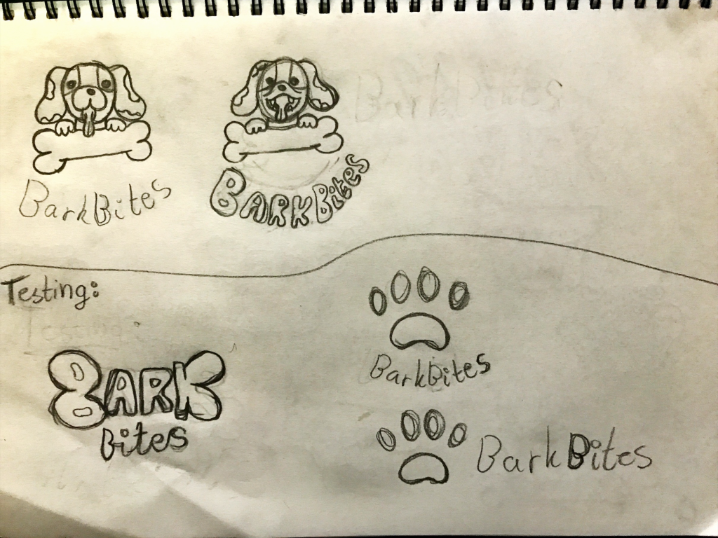
Construction – I started redrawing my chosen thumbnail, number 1. I did this until I reached what i considered a sucessfull logo.

Testing – The bottom section of the screenshot shows the logos i experimented a little bit more with to show some friends and hear their thoughs. Only having one friend available, I asked him. He though the first to the left was interesting and liked that the ”Bark” type turned into a bone object. The right illustrations were not as interesting to him, very generic and not eye catching.
Refinement – Choose your final design and execute it in Adobe Illustrator, along with the name of the product. Hand in your final logo as an A4 PDF.
Illustrator screenshot:
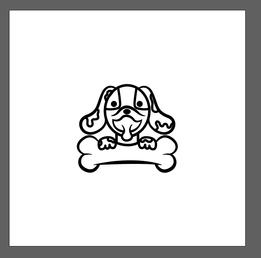

Final design:
After a lot of testing with different fonts etc, I chose one called Snugle. I think it has a friendly, but still modern and bold that fits well with the visual element. After seeing my typography warped, I ended up not liking it and changed this to a plain text underneath the logo. I also added shading and took away the ”spots” around the dog eyes so they would not be gone when I colored. The brand colors is yellow: #ffb302, blue #62addf and white.

