LT 2.1
Practical assignment (observation and analysis)
Use the logo you created in Week 1 and design a brochure for your product. You may use any format you like, just make sure that the format is in line with and adds to your logo design. Your brochure must contain an illustration. This could be the infographic alone, or it could be the infographic and the rest of the brochure (in other words, the entire brochure may be illustrated if you’d like).
When designing the brochure and creating your illustration, make definite use of the fundamentals of visual language as discussed in this lesson.
You must illustrate an infographic and design a brochure:
1. Illustration of infographic
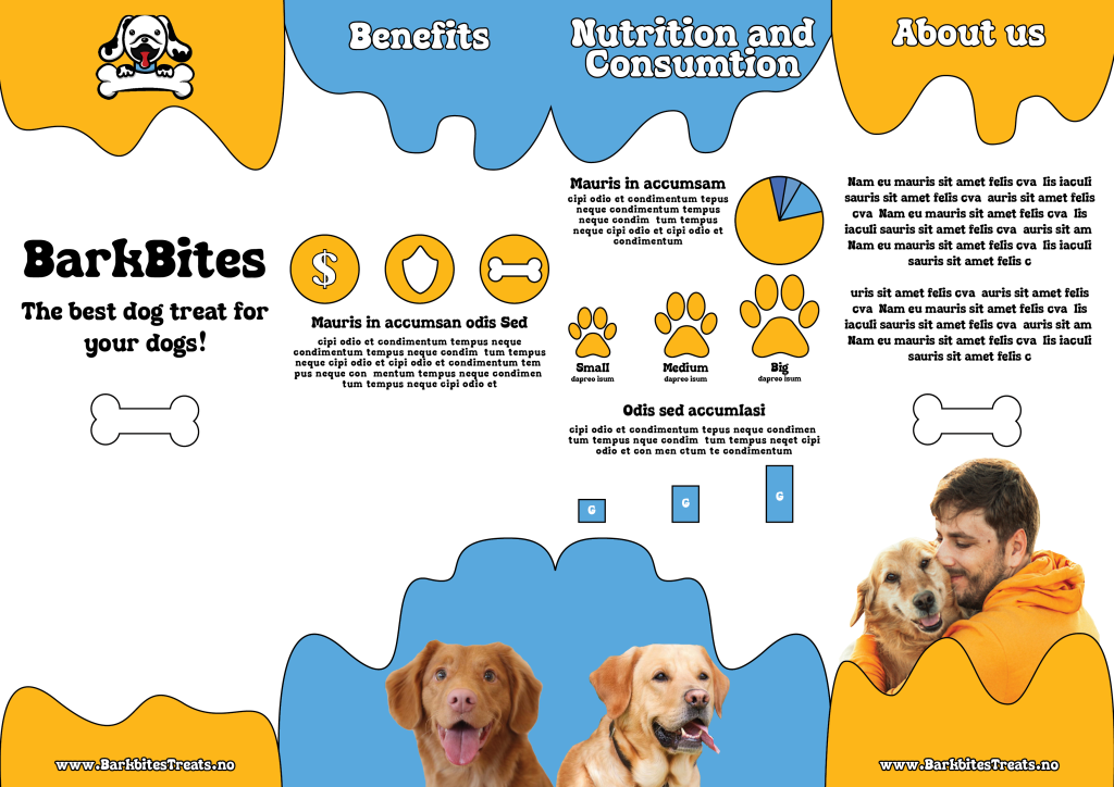
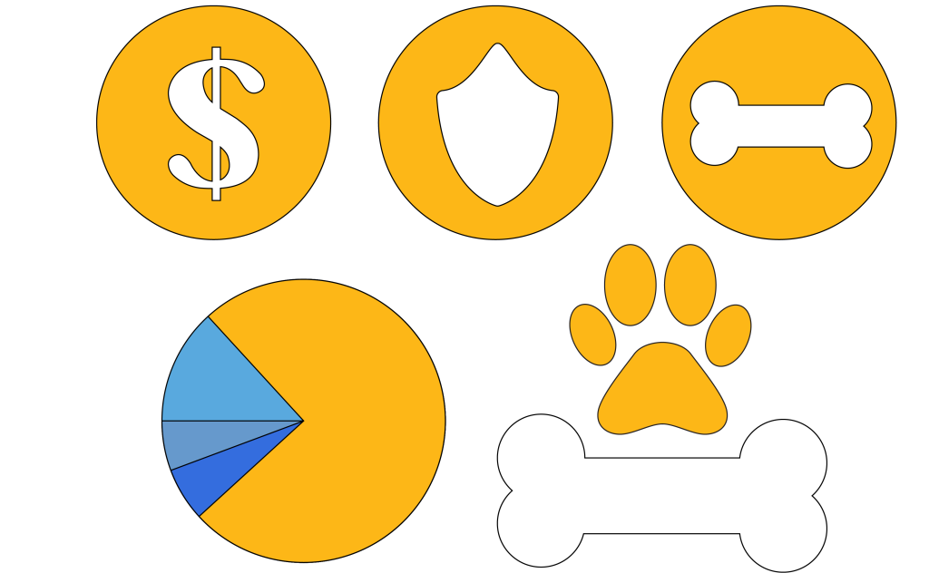
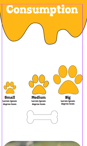
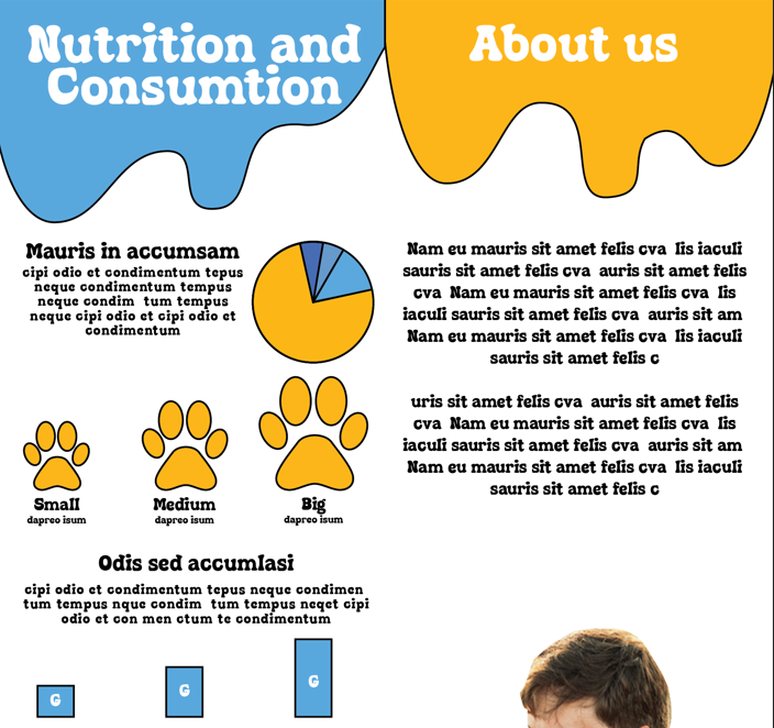
The brochure design and infographic illustration should work together. Consider the format and style of your brochure and illustrate an infographic using fictitious data (or you could do research to get a better idea of actual statistics). The infographic must display the nutritious benefit of your product to dogs. It should contain the nutritional value, as compared to the necessary nutrition intake of dogs. It must also give an indication of consumption per size of dog. You may also add information of your choice that you think is relevant.
2. Design of brochure
Design a brochure that introduces your product and includes the infographic illustrated in Question 1. You can decide on the information and format of your brochure. As a guideline, consider a brochure of A4 (lying), folding to A5 (standing). You don’t have to have more than four pages in your brochure (but it depends on your design and style). You must base your brochure design on the design of your logo. Thus, look at your logo and design a brochure that complements and blends in with it.
Report:
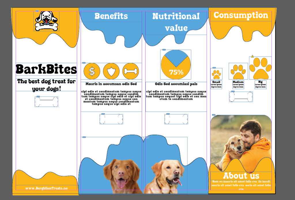
Firstly I started sketching out some layout designs for the brochure to figure out where i wanted to place my content. I used inspiration from Google to refine my own layout ideas. When sketching i tried having my illustrated cartoon styled logo in mind, so this would match. In the design I want to combine the illustrative and cartoon style with real pictures of for example different dogs. This is to make the layout more interesting, and making illustrations for all different dog breeds would be chaotic and quite some work. Then I sketched out some infograph elements to add into the brochure, this includes benefits, nutritional value and consumption per dog.
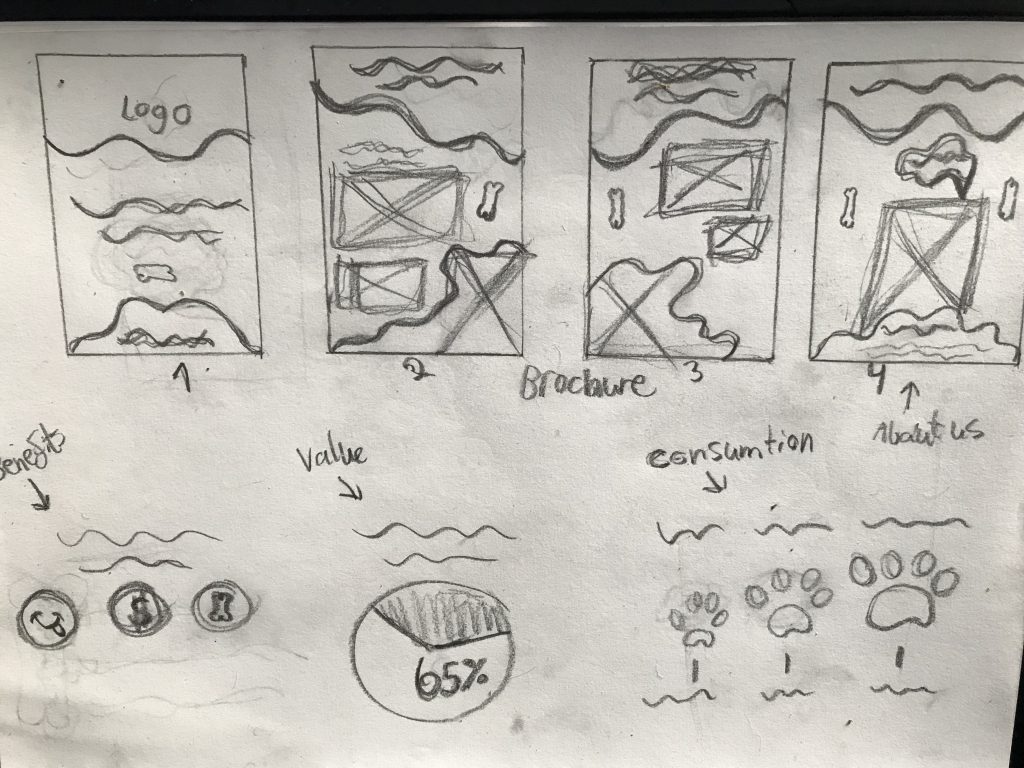
After sketching I put the infographs into Illustrator and started making the vectors for my brochure. The stroke used is 1 pixel, so this is what will use for other elements in the product.
I used Indesign to start making the brochure. I decided I only wanted 4 pages on my brochure to keep it simple and fun, so this would be a 4-fold brochure.
I started experimenting with different versions, specially color setup. I put on a stroke around the ”liquid” sections on the top and bottom of the pages to harmonize more with the original logo. I mainly wanted to go for plain orange with a hint of blue, but this turned out way to yellow and dull.
I looked for dog images online, and removed the backgrounds to only include the dogs so it would fit the design better. Found a nice picture of a man cuddling with his dog which I think fits well above the About us section. I also ended up moving the consumption section over to the left page
Lastly I added some bone elements to balance out the content and give some more detail into my design. and also added stroke to my headings to make the overall design feel more united.
When making the design I took use of these fundamentals of visual language:
- Position-Balance: I tried positioning each element to balance the overall design.
- Movement: The liquid wave elements in the top and bottom is trying to move the viewers eyes across the page.
- Empashis: The color contrast in the infographs in the middle pages are a try to implements this visual language, as well as balancing the elements.
I combined the consumption section and nutrional value section to fit the about us on the last page. I feel this gave a more open and spacious layout.
Final Design: