LT 7.1
Let’s practise what you’ve learnt today within the context of a very basic brief. Imagine you have been contacted by a local bakery called Crust & Crumb that opened in your neighbourhood. They would like you to help them with their website design. Your task is to create a low-fidelity prototype to show them how the header and menu could look and work.
Part 1
Design a logo for the brand to use on the website header.
Part 2
Consider which type of menu you might need for the bakery and create this in your choice of prototyping software (i.e., think about the website scope and information architecture as well as which content is most important).
Part 3
Add the links, at least one type of menu and other necessary interactive elements to your header wireframe.
Part 4
Make the required elements interactive using component states.
First I started with the logo, which turned out like this:
I figured I wanted to make a hamburger menu, so I started up Adobe XD to begin with the prototype. I wanted to include Home, Menu, About us and Contact links. I made everything interactive with component states.
Here is a link to the Adobe XD file: https://xd.adobe.com/view/c1ada38a-bdcd-4d19-a4f1-f41505374193-94fe/
LT 7.2
There are many bad forms out there! Now that you know all about forms, it will be easy for you to spot bad form design. For this task, you will be redesigning a form used to make appointments at a vet.
Part 1
Apply what you’ve learnt as you critically analyse this form from the Paw Paws Vet Clinic and list out what you think is wrong with it. You only need to look at the first two steps:
- Online booking 1/3
- Online booking 2/3
The first thing i noticed was that the description text for the form already was kind of problematic. It was
way to complicated text, and a lot of uneccesary information.
There is not really any error messages when you click a date before reason group and reason.
The keyboard navigation skips the first form all togeter.
Important information does not really have any contrast from the rest of the information.
When you choose a time on the day, the evening choise will not have any times found, so there is no reason
to have this option here.
The summary on appointment details are very clustered, not much space between the lines which makes it harder
to read and have an overview.
Part 2
Use the software of your choice for this part e.g., Figma. Screenshot the website and then redesign the form section (both steps 1 and 2). To help guide you, here is the list of tips we covered in today’s lesson:
- Keep it simple
- Mark optional or required fields
- Use visual design strategically
- Use persistent labels
- Consider the context within the user flow
- Use verbs for the submission button text
- Programmatically set the right keyboard for touchscreens
- Make use of inline form validation when possible
I decided to use the sotfware Adobe XD for this task. I chose to do some general color palette changes, minor field changes etc.


Part 3
Choose three components anywhere in the form that will show error states i.e., what happens if the user submits the form and there is a problem? Remember that a good designer will try to help users with the use of error messages. Error messages are not there to make users feel bad if they’ve made a mistake filling out the form.


LT 7.3
Your task is to create a basic prototype to showcase the parallax effect using the prototyping software of your choice. The focus of this task is on applying the parallax effect, rather than perfecting the layout of the website.
Part 1
To guide you, here is the video by Jesse Showalter that we shared earlier in the lesson. Watch it carefully to make sure you have a clear idea of how you will complete the parts below.
Part 2
Design your own product site (two artboards that are sized to a desktop screen’s viewport) as seen in the above video.
Alternatively, you can use an existing website (e.g. change the layout of the Milanote website as required).
Here is decided to make my own quick little e-commerce website design to test out this effect.

Part 3
Think about how you will add the parallax effect into the design and then go for it!
This is the results (as shown in the video you would have to press the key up and down button to switch pages:
https://xd.adobe.com/view/b122f858-8a29-4bad-b0d3-bd2aabdbeeab-e471/
LT 7.4
For this task, you will be creating your own email newsletter using MailChimp. Once you’ve completed the newsletter design, you’ll be sending a test email to a classmate or friend.
Part 1
Take your time as you populate the template with meaningful images and content. For this task you can create an email for any brand you like, it can even be your own invention.
Here are a few business ideas:
- A florist
- A pet accessories shop
- A tree nursery
- A shoe or clothing shop
- A bakery
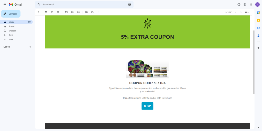
Due to the leading up towards Black Friday the 25th november, I’ve taken on a job from a business to make their newsletter and send out a e-mail for this occasion. I chose to build the newsletter out of the sales template.
Part 2
When your email newsletter is complete, preview it and make the required changes (if any).
The preview looked good so nothing had to be changed.
Part 3
Finally, send a test email to a classmate or friend. Discuss the email you sent with your classmate or friend. If you used a classmate, you can also discuss the mail they sent to you.