LT 3.1 Styling Images
You need to create an HTML and CSS document for this lesson task. Use one root folder containing separate CSS and image folders. Find three images you can use; one will be used as a background and one as part of the content, while the third should be a simple png with a transparent background.
Link the styles.css file with the HTML document using the property inside the section of the HTML document.
Part 1
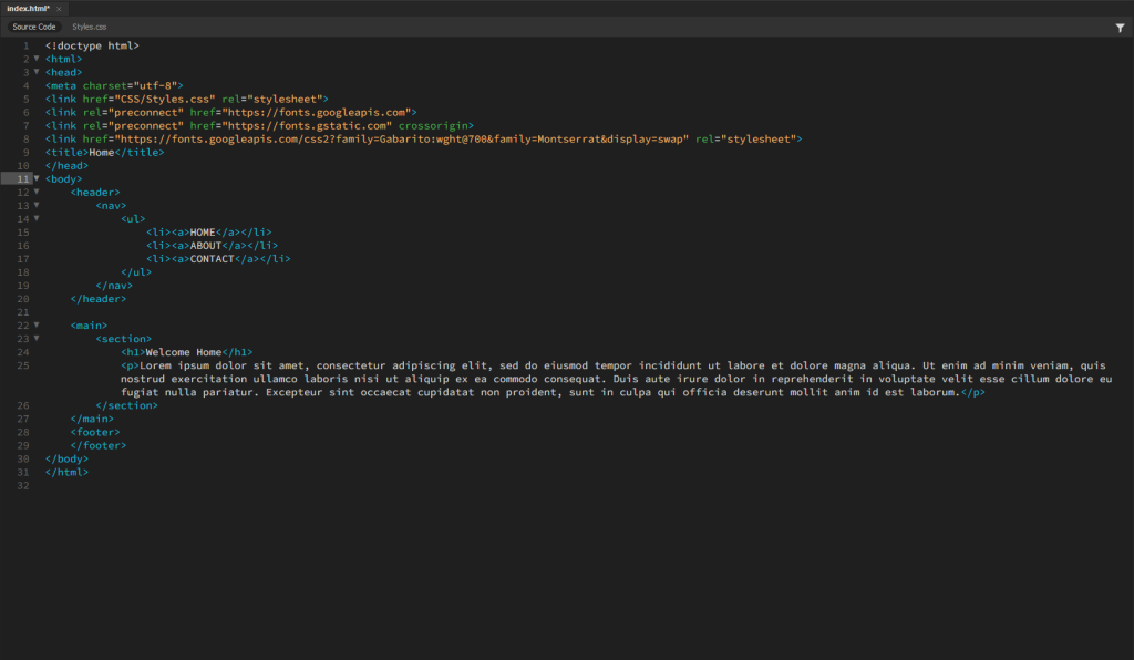
Create a basic structure for the HTML document with a <body> containing a <header>, <main> and <footer> section. Insert an <h1> element into the <header> section and an <p> element with text inside the <main> section.
Using CSS, apply the following to the HTML page:
- A background image for the <body> section;
- A solid colour background for the <header> section, but with an opacity rule applied so that the background image is slightly visible behind the <header> container.
Once you have the background image showing, apply different values to the background properties that will produce the following results:
- A repeated pattern of the background image using the properties “background-repeat” and “background-size”.
- Place the background image in the centre of the screen using the properties “background-position”, “background-size”, and “background-repeat”.
- A full-page background image that fills the screen using “background-repeat” and “background-size” (remember that size can have specific values in % or px, but it can also have relative values like “contain” and “cover”).
Write a short description explaining how the property values changed the behaviour of the background image. This should be loaded onto your blog.
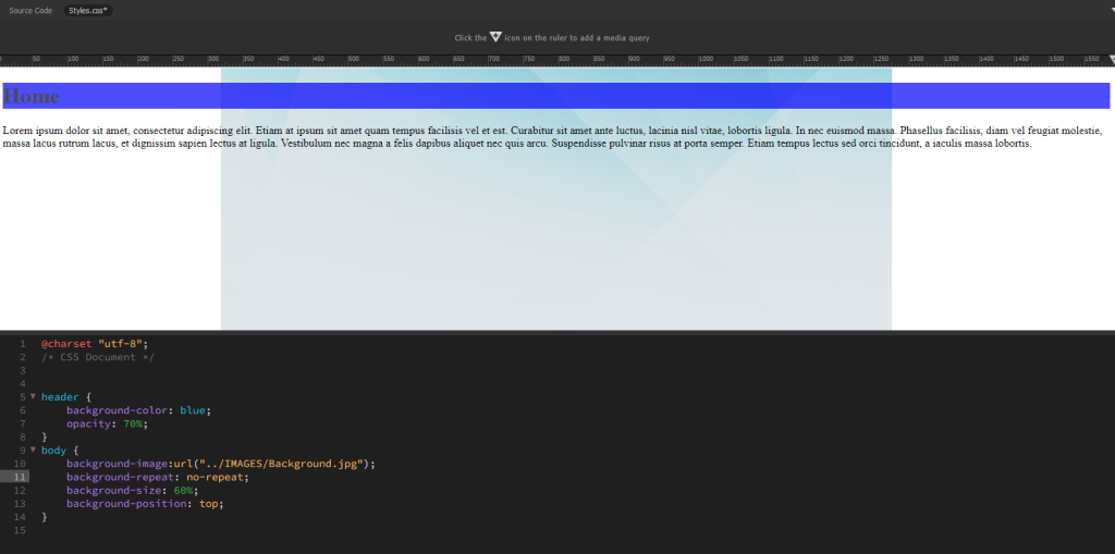
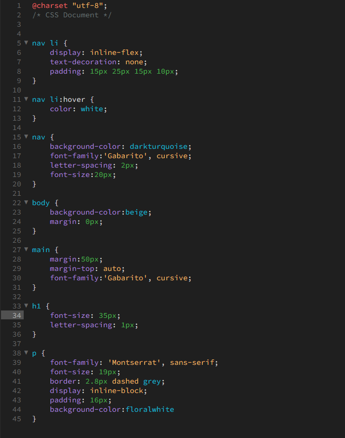
Repeated patterns:
The background-repeat made the image repeat several times across the website. The background-size: contain made the repeated image be contained within the website.
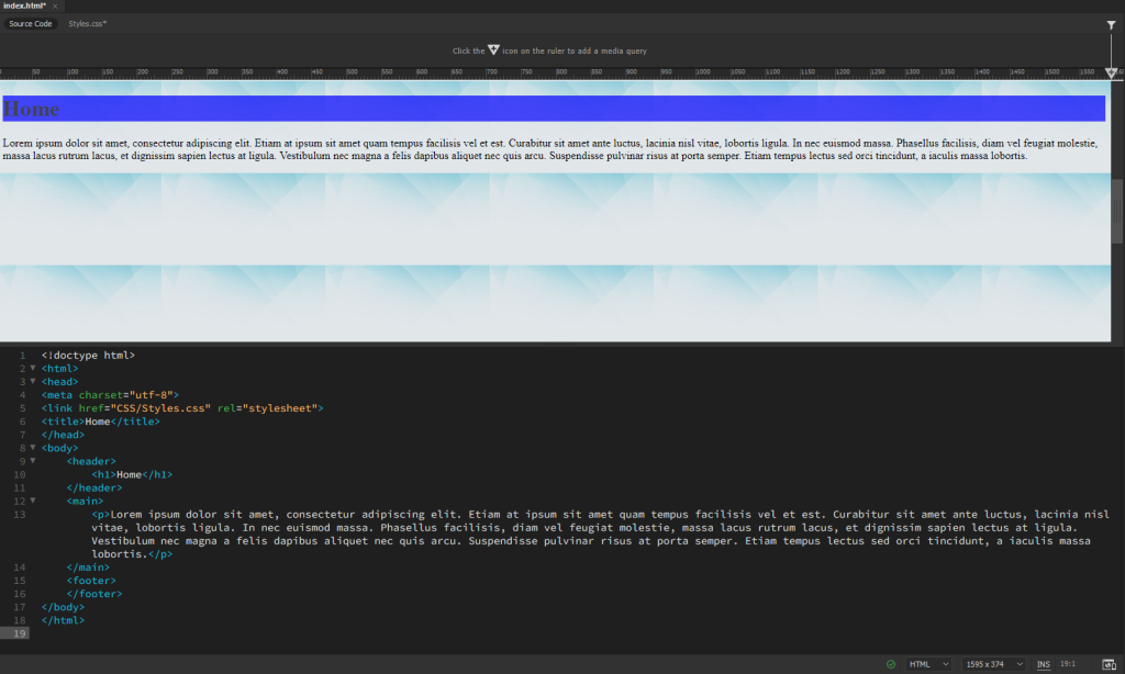
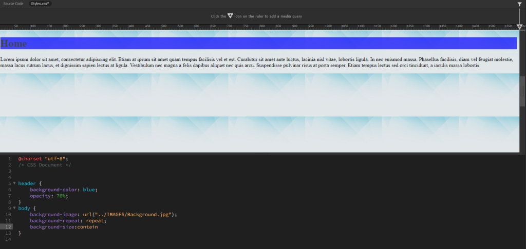
Image in the centre:
The background-repeat: no repeat makes the image not repeat itself.
The background-size decided how big the image is.
The background-position decides where the image will be placed, but i had some issues here choosing ”center”. The image simply would turn fully grey, so I found out going ”top” was the same as center but kept the content remaning.
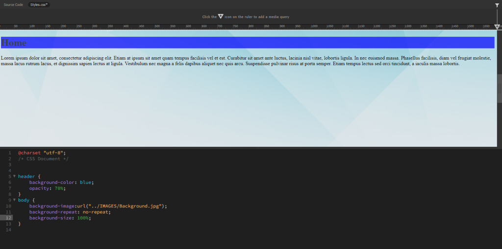
Full-page background:
The background-repeat made sure the image did not repeat itself.
The background-size is at 100% to make sure the image fits the whole website.
Part 2
Insert a div with a class into the <main> section of the HTML page. Specify the div’s size using a CSS rule that includes a height and width property. You can also specify a border so you can see the empty container. If you need to refresh your memory on border styles, visit this link.
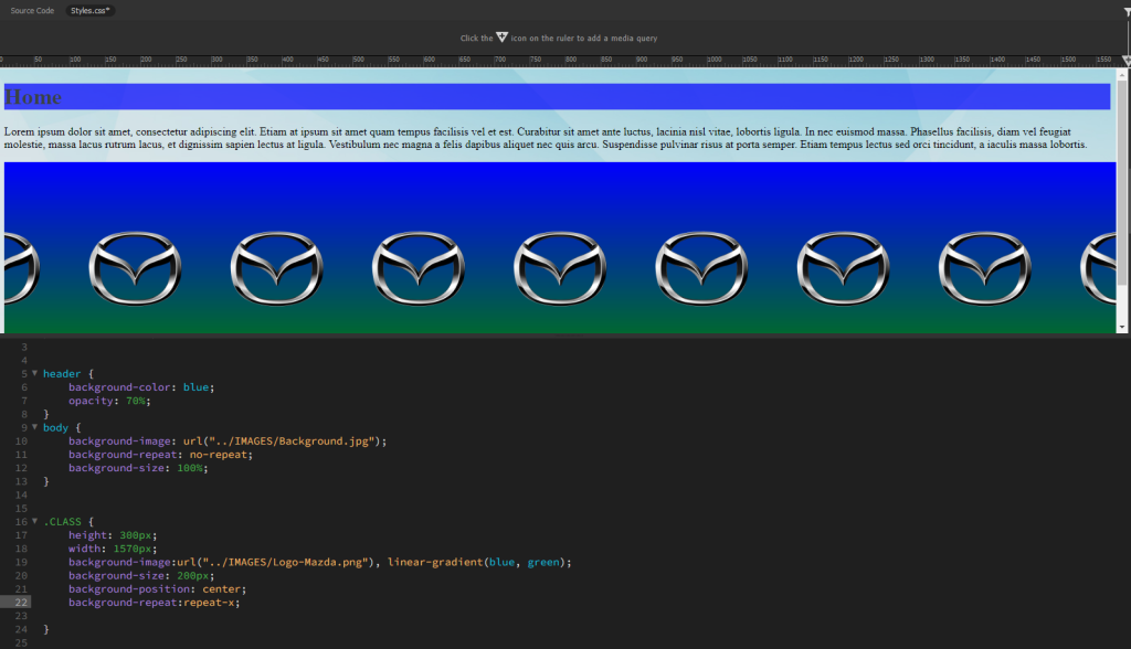
Once the empty container is showing up in the browser or result view, add a multi-layered background to the container that includes the following:
- A gradient;
- A pattern made up of the png image you collected earlier
Take screenshots of the CSS code and the result, and write a short description explaining how the property values changed the behaviour of the background image.
Screenshots and Notes:
The height and widht decides how big the div section is.
The background size decides how big the image is.
The position decides where the image is placed, in this instance center in the section.
The background repeat is set to repeat-x to only make the image repeat in the x-axes.
Part 3
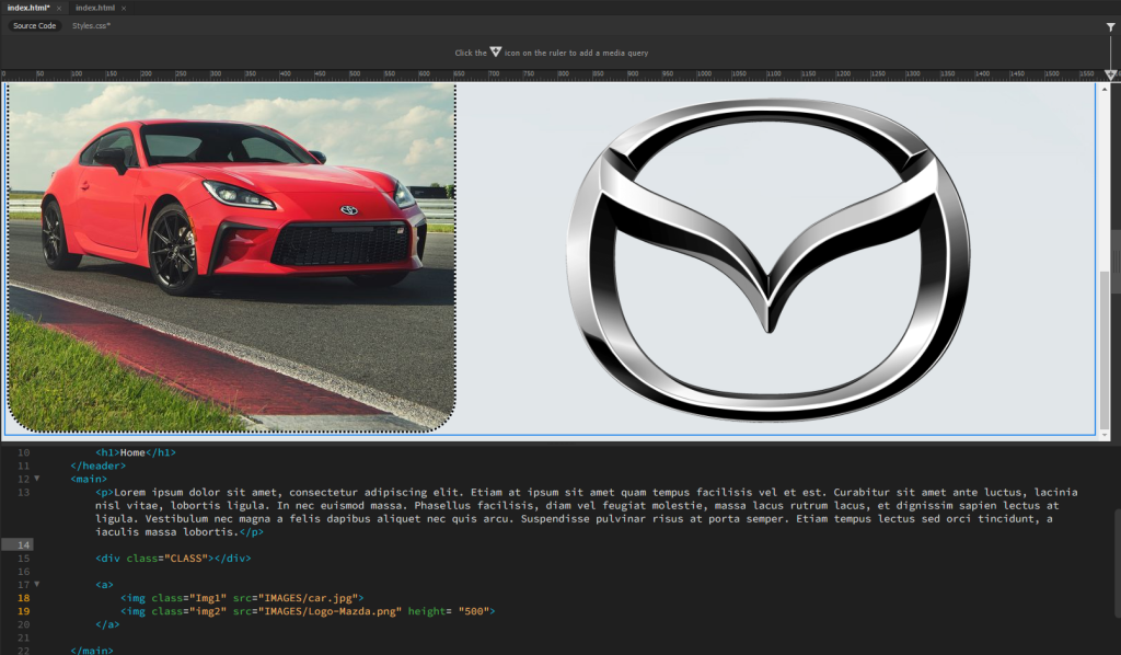
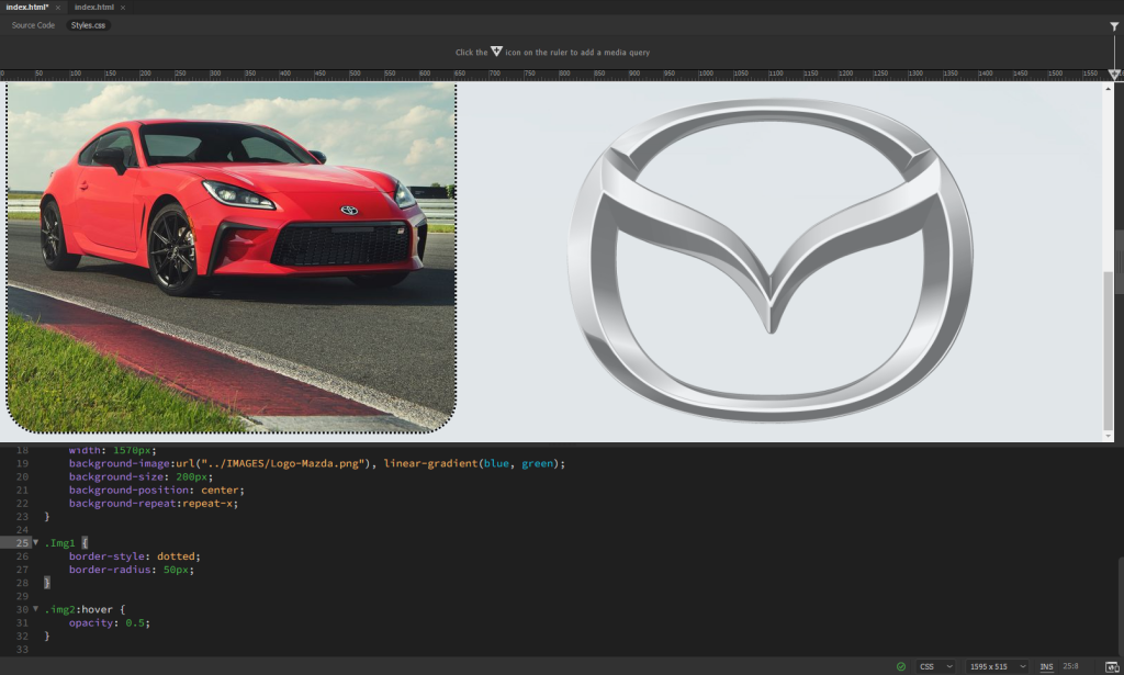
Insert two images in the <main> section using the <a> property in the HTML code. Using CSS, do the following:
- Apply a border radius property to the first image;
- Apply a pseudo-class property to the second image that reduces the opacity on hover.
Take screenshots of the HTML and CSS code as well as the browser results to load onto your blog.
Screenshots:
LT 3.2 Layout elements
Part 1
Copy this basic structure into the body of the HTML document and indent the code so that it shows the nested relationship of the content:
Part 2
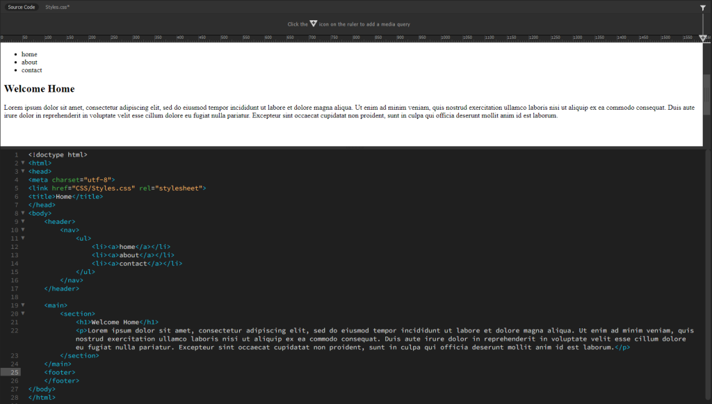
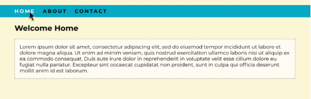
Using what you’ve learned so far, try to recreate the following browser display using CSS to style the above HTML:
Here’s a list of things that should be included in the HTML/CSS:
- Classes;
- Inline block display;
- Margin properties;
- Padding properties;
- Font family;
- Background colour properties;
- Border properties;
- Pseudo-class for the hover effect on the navigation menu.
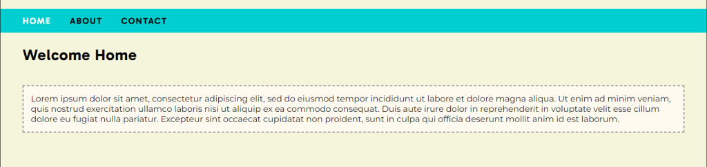
My result:
So this task was quite hard, but with a good amount of thinking and doing some parts at the time it went fine. I found out I could do a lot more than I thought. I had some issues remembering how to align different elements but quickly found this out by going back into the theory before the LT’s.
LT 3.3 Styling Layout
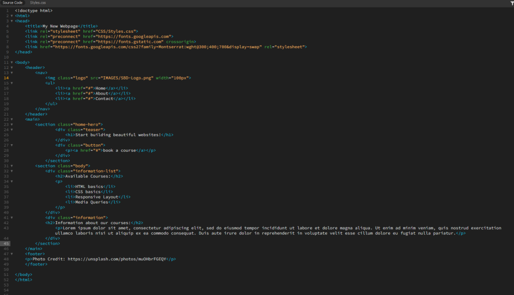
Download the exercise files containing the basic HTML document, logo and photograph. You will have to create a CSS document for this lesson task. Use one root folder to save the HTML file, and use separate CSS and image folders. Link the stylesheet to the HTML document using the link attribute in the <head> of the HTML document.
Goal
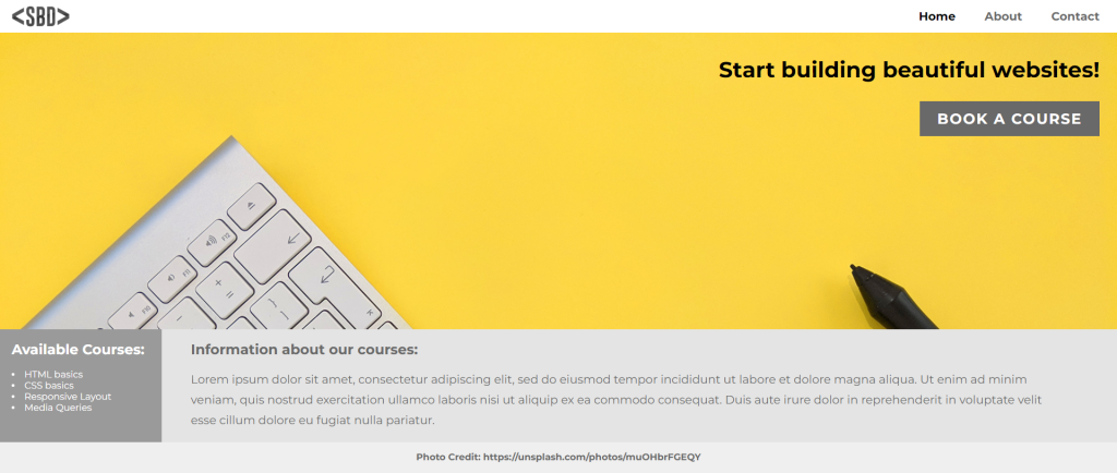
Look at this layout for a fictitious website advertising web development courses. Use what you have learnt to create the same layout (or as close to this as possible):
Part 1
First, examine the layout and draw a wireframe showing the different sections of the page. Then, inspect the HTML code to find the hierarchy of parent and child elements that respond to the sections you identified. Write down the names of the classes of the parent containers that make up the basic structure.
For example: <nav> is the parent container that holds two siblings: the logo image and the <ul> that make up the navigation menu. The <ul> element is the parent container that holds the three list items: Home, About and Contact.
Part 2
Start styling the different sections by assigning rulesets to the existing classes. Here are some tips you might find helpful:
- The body element, by default, has some margin around the edges. To remove the margin, set it to 0%.
- Flex was used to style the <nav> element as well as the first hero image section.
- To get the elements within a flex container to align to the left and right sides of the window with space between, use the CSS rule “justify-content: space-between”.
- Remember, padding creates spacing within an element (between the border and the content), while margin creates space between elements (outside the element’s border).
- To align elements within a flex container right, use “justify-content: flex-end”.
- Grid was used to style the information section below the image.
- Position was used to create the footer.
Here is the CSS file to show you how we solved the above layout.
Take screenshots of your result. Write a short summary about how well you think you could redo the example website. Comment on what you’ve learnt.
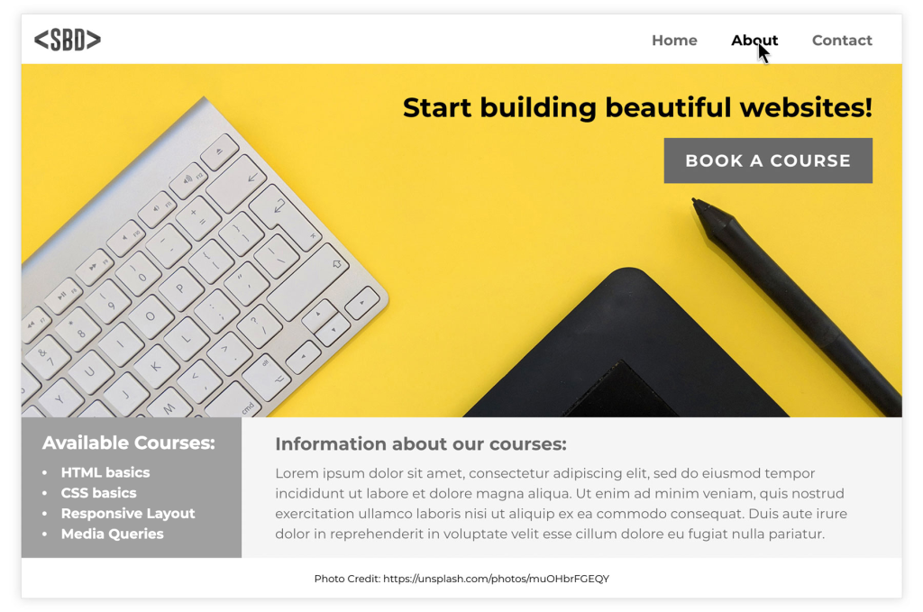
My result:
I felt this part contained a lot of information. As the last tasks, I started with what I knew 100%, and then started with testing for the other code I was unsure about. Whenever I came over problems and testing did not work I went back to theory to figure it out that way. I think I managed to redo the example website pretty good, but of course small details like font size and color is hard to match 100% just from an image without using a software.
The only big issue I came across was not being able to display the image the correct way according to the example. My image would simply not display like the one in the example, but rather way lower so only the top parts of the elements in the image would show.