Part 1
Now it’s time to get typing. This is the start of your strategic planning and research; you’ll use all this information in your report. To start this activity, you need to have knowledge about the course assignment (found at the bottom of the Module Overview page) and answer the questions with the brief in mind.
- Who and what are Brodie’s Books? Describe the client and the business in your own words. Include things like their location and the unique concept they have for their retail space.
ANSWER:
Brodie’s Books was created and established by husband and wife, Isla Stewart and Njabulo Dlova in Edinburgh, Scotland. They started this company 15 years ago and named the shop after a famous Scottish fictional character, Jean Brodie. In recent times they have started brewing their own coffee as a passion. Their store is considered a luxury bookshop focusing on rare collectible second-hand books. They have mainly been operating online on Ebay and have a yearly booth at Edinburgh Fringe Festival, but now they want to expand into a local store in the Royal Mile section of the city, which is popular among tourists. With the goal of building a community around their new bookshop, they want to have a coffee bar in the store to sell their own custom-made coffee. The shop will be furnished with random items from thrift stores, and they want the store to become a tourist attraction and haven for book lovers, momentarily escaping the hustle of everyday life.
- What are Brodie’s Books’ unique selling points? What makes them stand out from their competitors?
ANSWER:
The main selling point has to be the custom-made coffee, while also providing rare collectable second-hand books. The rare books attract people across the world. A unique van and bicycle are also good selling points, whereas I have not seen a bookshop using this to deliver coffee to restaurants as well as using it to market their shop while driving around. That is a good selling point because they stick out from their competitors. The plan of furnishing with random items from thrift stores will also make a good selling point to interested souls walking by.
- Who is Brodie’s Books’ target market? Create at least two buyer personas to define your target market clearly.
ANSWER:
- Book Lovers; Customers who have a love for physical books and enjoy browsing bookstores. (Customer we aim to attract more of)
- Casual Reader; Customers who read occasionally and prefer to buy books in-store. (The primary customer Brodie’s Books has already)
- Gift Shopper; Customers who purchase books as gifts for others both online and in-store
- Who are Brodie’s Books’ competitors? Name at least two and describe their brands in a couple of sentences.
ANSWER:
https://leakeysbookshop.com/ :
They mainly use white and black, but they have their own unique green color as brand color and for different elements to stand out. I think they chose this color to seem more sophisticated and trustworthy, as green often gives this feeling. They have been in this business for forty-four years as displayed on the landing image and got established by bookseller Charles Leaky. The shop is in the Scottish Highlands. Their focus is buying and selling books, with a large collection of rare books with about 8000 samples. Their location looks packed, old school and has a library feel to it. Their logo is simply their name in a neat, old looking but also modern serif font that catches the essence of heritage in the company. The logo symbol is a LB within a green circle which gives some kind of luxury feeling. They have an online presence, but mainly focus on doing business in person.
It is a very basic bookshop, focusing only and solely on selling and buying books. There are no other main selling points than selling and buying books, which I think can work but also is a mistake due to not really sticking out. A thing I do like though is that they sell custom cotton bags for customers to use for carrying a gifted book which inspires the gift receiver to visit their shop in Edinburgh.
https://www.aberfeldywatermill.com/ :
This brand has a unique blue color as their brand color, probably to reference their logo and name which is ‘’The Watermill’’. The location is extremely old, but only got started being used as a bookshop and café in 2005 by the founder Michael Palin. Their selling points are selling books, art gallery and café. Their logo is a simple drawing of half a watermill and shows a kind of traditional element. This fits well with their location, which seems cozy, relaxing and old-school. They use sans-serif font for their headlines and sans font to their body text.
Some things I don’t think works are the blurry images on the website, which gives a feeling of not being professional. They also seem to miscolor their footer which does not match the blue they use for nav bar and logo.
Write down a goal (what does the client want to achieve?) and how you are going to achieve that goal?
ANSWER:
The goal is to make a new brand identity with a community in the new bookstore with the help of rare books and custom-made coffee. They want more attraction to this store with the help of some new features. To do this, I will make them a whole new brand identity with a new logo, typography, color scheme and overall visual style. As well I must make the van and bicycle branding, packaging design and custom gift packaging.
Part 2
Create a brand positioning statement for Brodie’s Books using the template below. This should feature in your report.
Brand statement: ’’To book lovers, Brodie’s Books offers a gateway to relaxation and the exploration of new worlds through a collection of exquisite, rare books.’’
Create a personality for Brodie’s Books. It is up to you how you want to figure this out: you can use brand archetypes or simply attribute things to your brand to form some kind of personality. Describe this personality in your report.
Personality: The Sage, Brodie’s Books aims to be a source of wisdom and inspiration through literature and the added comfort of a coffee bar. It portrays a sense of authority and trustworthiness, appealing to the customers who value both intellectual pursuits and a relaxed, welcoming atmosphere.
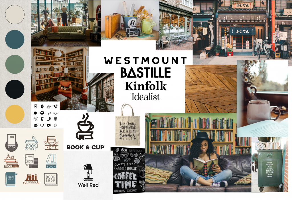
- Create a mood board for Brodie’s Books by specifically looking at the visual elements below. This mood board is going to guide you in a stylistic direction before you even start with the logo design. Include this mood board as one of the pages in your report.
Find visual inspiration for all the following elements of the brand:
- Typography (what kind of typography will go with the brand personality?)
- Colour Palette (find inspiration for a colour palette – use Adobe Color if needed).
- Pattern and texture (do you want a supporting pattern to use within your brand identity?)
- Supporting visuals (photography/animation/illustration).
When getting elements for my mood board, I went around online to find images, patterns and textures. For my color and fonts, I went into google fonts and adobe color to experiment and find something that could fit the brand. The shop got named after a Scottish fictional character, Jean Brodie which I did some research on. The story was set in the 1930s, which I thought I wanted to take some inspiration from when thinking about my elements.
Part 3
You need to start with the logo design process. You’ll only focus on ideas and rough sketches for this part – all of which should be included in your report. The next part of the module assignment will be a continuation of this process. For this, you need to:
- Generate ideas for the Brodie’s Books logo – like mind mapping, for example. Include this ideation process in your report.
- Use your ideas generated above to sketch visual ideas for the logo. Include these sketches in your report.
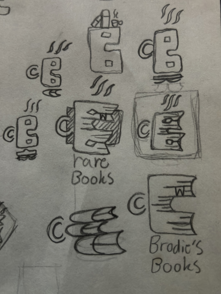
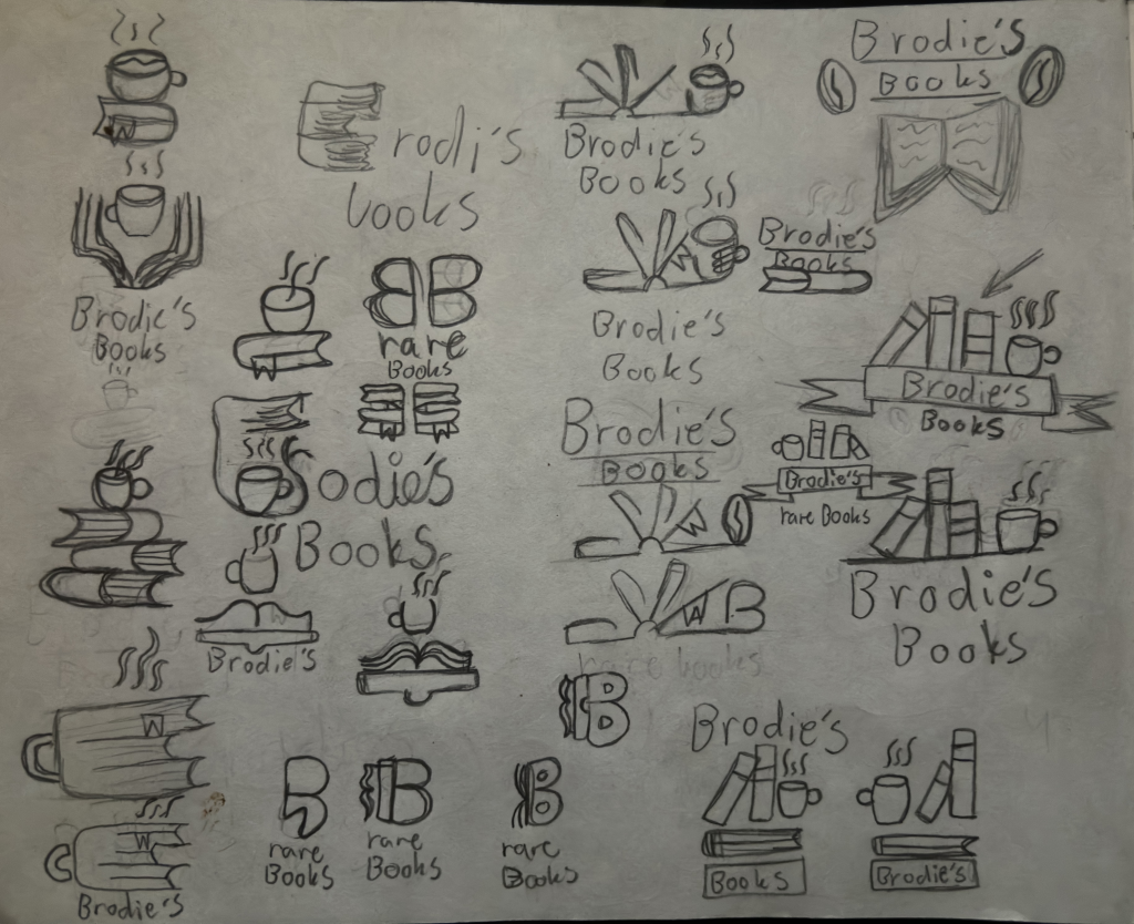
Generate ideas for logo;
I started making a mind map to generate some ideas, and after that I rather felt like simply sketching a lot of ideas to generate more, and this worked fine. I also used the internet to look for inspiration to get some basic ideas to build on.
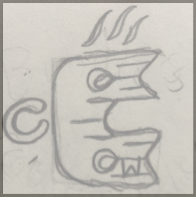
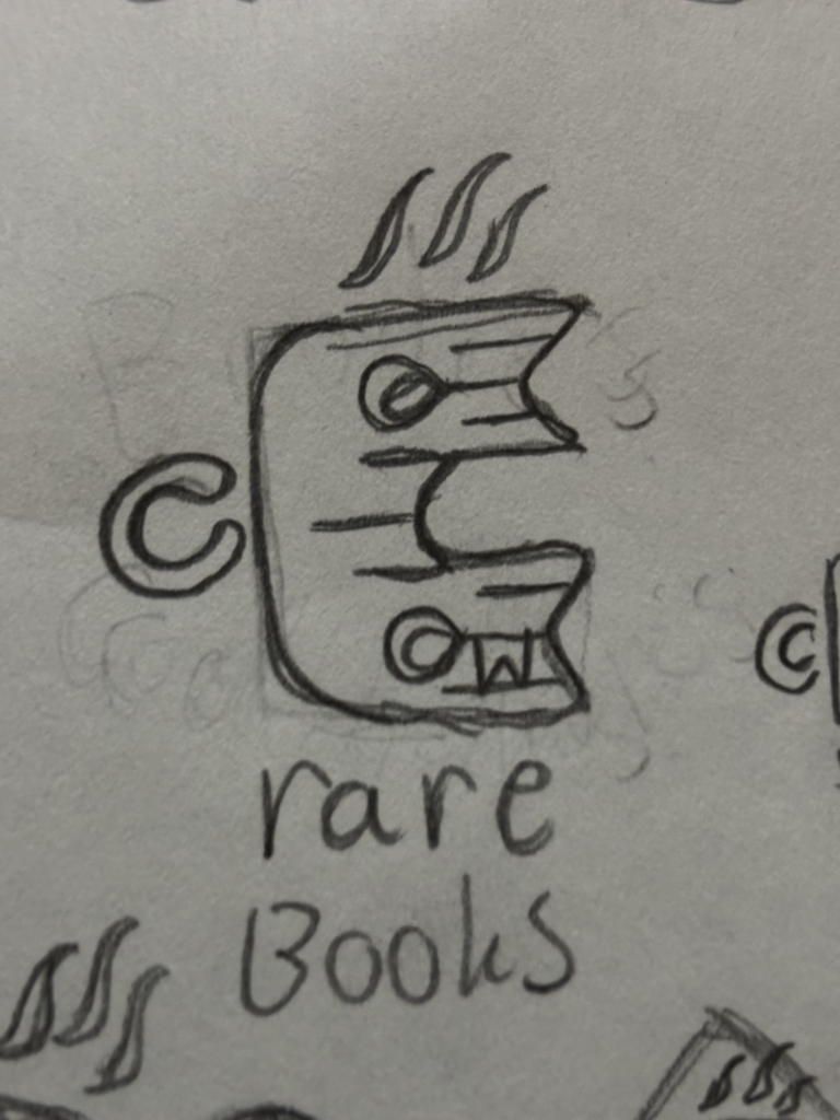
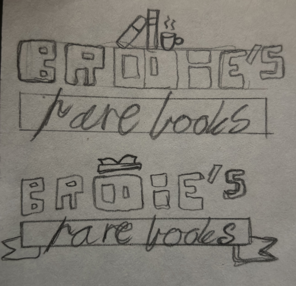
Rough logo sketches;
After generating ideas and sketching a lot, I had to eliminate almost all of them, and I decided to keep 3-4 that I tried building more on to find my chosen design. After a good while of thinking, I decided to go for the book-stack symbolizing a B letter with coffee symbols on top and on the sides.

Part 4
Hopefully, you have lots of rough sketches for the Brodie’s Books logo by this stage. Now you need to go through the elimination process (yes, you must ‘kill your darlings’) and decide which of your ideas are worthy of vectorising.